Ontario's lost vaccine efficacy data
Screenshots from December 2021 to April 2022

The data regarding vaccine efficacy for Ontario was removed from their website in April 2022. It is unfortunate, as the data showed quite convincingly just when vaccine efficacy for preventing covid ended.
In this screenshot, the red arrow shows the point where cases per capita was lower in boosted Ontarians - on December 23rd or 24th, 2021:

From this point onward, for the next four months (when data stopped being displayed), “fully vaccinated cases” consistently demonstrated a higher rate of covid than unvaccinated cases:


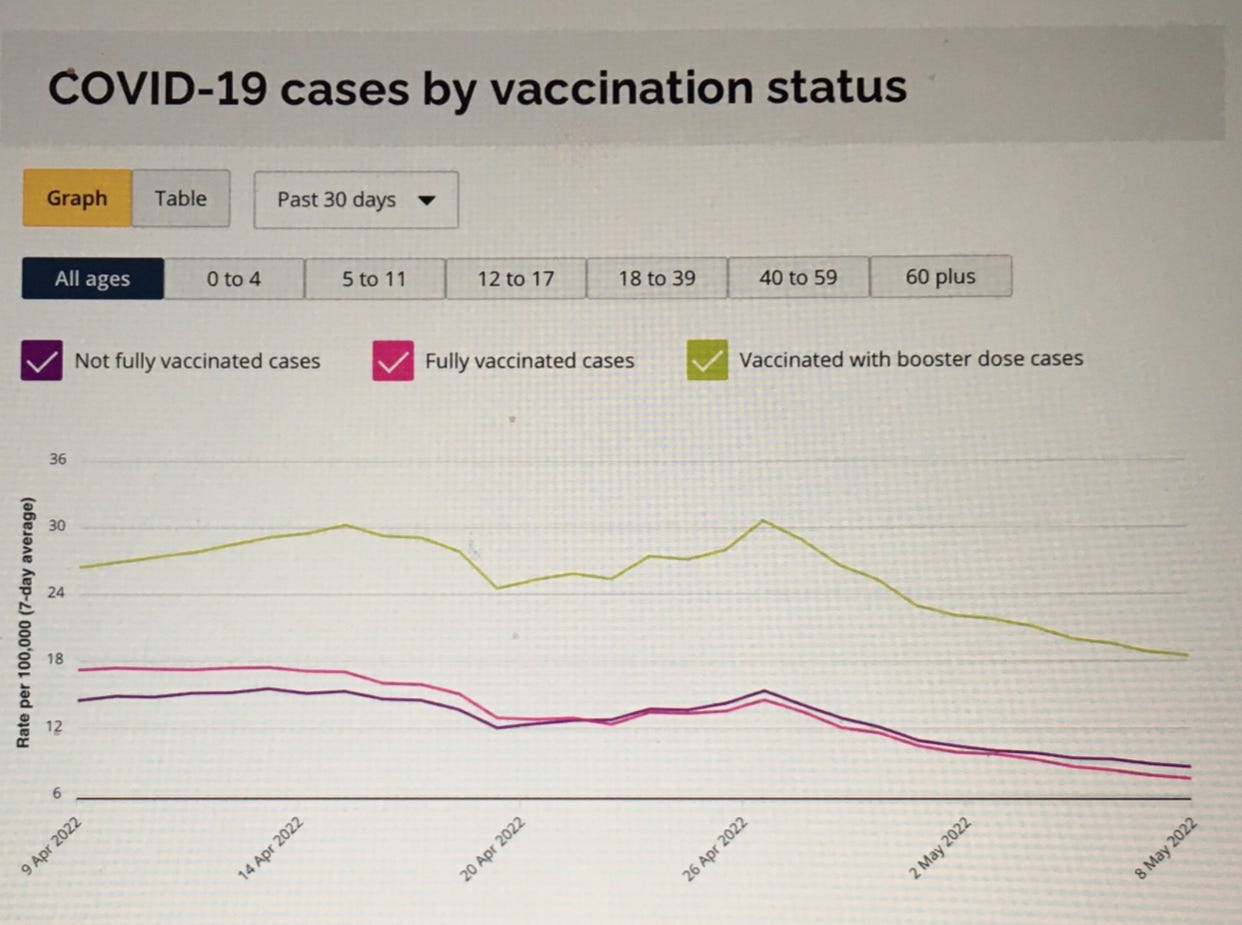
It would be very interesting to see this data properly analyzed.
I'm glad someone was wise enough to take screen shots. I wrote down the numbers most days from February onward, but I never thought they'd simply disappear the data.
There is nothing suspicious at all about removing data that doesn't play into the narrative, right? (insert eyeroll)
One thing that always stood out to me: the unknown (vaxx status) category for hospitalized and ICU. This number was never displayed on the pie charts, resulting in the UV looking like they were a larger proportion than they were. Most days, the unknowns were close in number to the UV in hospital or even a higher number than the UVs in the ICUs
E.g., Feb. 25th, 2022:
Hospitalized: 1003 - number displayed on the table
Piechart:
UV: 239
PV: 29
FV: 557
________
825
Subtracted from 1003 = 178 UNK (definition on MoH website indicated vaxxed where vaccine not approved in Canada or not on the Health Card record)
ICU: 297 - number displayed on the table
Piechart :
UV: 69
PV: 7
FV: 91
________
167
Subtracted from 297 = 130 UNK
Most people, if they looked at the pie charts at all, would not be aware that the numbers didn't add up to the totals, not to mention the fact that some admissions were found C19+ on a routine test.
Alberta data did that too quite clearly and then they pulled it. It was unfortunate as if they have this info they know the harms of pressuring and coercing people to take the shot.